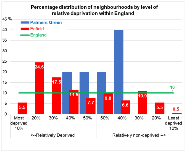
 A chart showing how the new Palmers Green ward compares in terms of socioeconomic deprivation (Source: 2022 interim ward profile)
Enfield Council has published interim statistical profiles for the new wards that came into effect in May this year, plus an updated version of the borough profile. The profiles contain demographic, environmental and socioeconomic factors, and comparisons with borough-wide, London-wide and national averages
An introductory page on the council website, with links to the individual profile documents, notes that
Our borough is 12 miles from the centre of London and covers an area of 31.7 square miles (82.2 square kilometres, 8219 hectares). In 2020, we had an estimated population of 333,587 with a large population of both 0-14s and older people in comparison to the rest of London. It is a diverse place, which has welcomed communities from across the world. In particular, it has large Turkish, Greek and Cypriot populations.
Life expectancy is above the UK average but health outcomes vary significantly across the borough. Some of our wards are amongst the most deprived in England, while others are relatively affluent.
The introduction to the Palmers Green ward profile explains why it is only provisional:
At time of writing, official ward-level data and official geographic lookups are not available. Any statistics appearing in this document have been aggregated from smaller statistical geographies on a ‘best fit’ basis. Therefore, we cannot guarantee 100% accuracy of any information contained within this profile.
The profile has been collated using the most up to date local-level data relating to 2021 as far as possible, although for some key statistics, the most recent data we have are still the 2011 Census. A variety of statistical sources, both national and local, have been used in its compilation.
Unfortunately, the interesting data on things like country of birth, languages spoken and ethnicity are more than a decade out of date, and so much has happened over those ten years to make me wonder how meaningful they are. Let's hope that updates come along soon. (And the profile lists Park Lodge GP practice as being in Old Park Road, when it moved to Winchmore Hill nearly five years ago!)
Something which stands out starkly in the borough profile is the difference in the level of socioeconomic deprivation between the east and west of the borough. On the map below the pink or red colouring shows areas that are within among the most deprived 50% of areas in England - the darker the colour, the more deprived. (The east-west contrast is hardly news, but the amount of red in Ridgeway and Whitewebbs wards is surprising.)
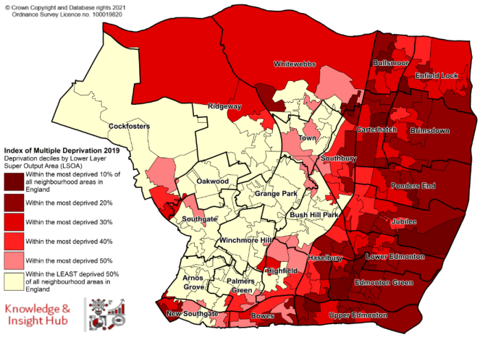
Looking more closely at Palmers Green ward and the six wards that are adjacent to it, there's an interesting tie-up between the amount of pink and red in a ward and the way the electors voted in May.
Highfield, Bowes, New Southgate and, to a lesser extent, Palmers Green itself have plenty of red and pink, and they all returned Labour councillors. Southgate, Winchmore Hill and Arnos Grove are mostly off-white, ie most of the areas in those wards are in the 50% least deprived category, and they all have Conservative councillors.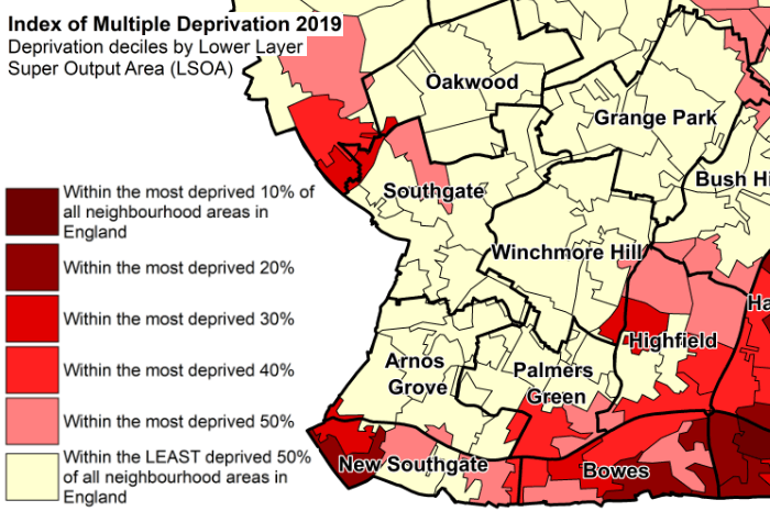
Something which must have made a big difference in May was the replacement of the previous Southgate Green and Bowes wards by three smaller wards - Arnos Grove, New Southgate and Bowes. The old Southgate Green ward was a mixture of some very prosperous areas - eg the Minchendon Estate - and some deprived areas, eg New Southgate. The two old wards returned six councillors between them, the three new ones the same number, but now with two Conservative seats in Arnos Grove pretty much a certainty.
I'm not saying that either the old arrangements or the new ones are "fairer" - and I think that the new pattern is probably a better fit with the areas that residents identify with. The fact that redrawing boundaries can make a radical difference just shows the essential unfairness of any first-past-the-post system. The system was unfair in 2018 and just as unfair in 2022, especially for the Greens and Lib Dems - but not just for them.