


Thanks to everyone who has filled in our online survey about the proposed clock for Palmers Green Triangle. If you haven't done so yet, you still have until the end of the month. In the meantime, some information about what people have said so far.
 At the time of writing (11pm on Wednesday) 39 people have responded. There has been near unanimity about a wish to retain the triangle island, but opinions about the clock have been far more mixed.
| Should there be a clock? | |
| - Yes | 25 |
| - No | 14 |
| Like the proposed design? | |
| - Yes | 20 |
| - No | 19 |
| Keep the traffic island? | |
| - Yes | 36 |
| - Don't mind either way | 3 |
| - No | 0 |
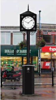
While those who don't like the proposed design are in a minority (narrowly), some of them have been eloquent in their condemnation, many regarding it as a pastiche of an older style, showing a lack of imagination.
Below are abridged comments made by some of the people who were (more or less) positive about the clock design:
...quite tasteful and classic...
...it's ok, nothing special
In keeping with the old style buildings and houses in the area
Design ok just don't think it will add anything really
Traditional, prominent, draws on local features.
It may not be what I would have chosen personally, but reading the literature provided has persuaded me of the merits of the chosen design.
We like the fact that architectural features surrounding the Triangle have been identified and then incorporated into the design of the clock.
Seems like a nice idea and I think this design is quite appealing. Important to have a good sized clock face so that it is easy to read.
Those who didn't like the proposed design have been rather more eloquent. Some excerpts follow:
Would it not be possible to encompass a clock in a London brick surround?
dull and totally pointless
Not very inspired. Was expecting something more contemporary.
Pointless. Cafe would have been better using underground lavatory space - no imagination in this.
...too traditional...Very little imagination
[I would prefer something like] The Crouch End clock
This design is very dull if not downright ugly. It would not in my opinion represent good value for money as its 'mock heritage' design does not satisfactorily reflect the fine buildings that give Palmers Green its distinct character...Someone commented that it looks like a patio heater - I couldn't agree more.
...poor design and the wrong scale and will clutter up the space... It just looks silly on a such a stumpy post
...inelegant and would do nothing to enhance the area. The design owes greater parentage to the CCTV tower and lamp posts as it does to Edwardian architectural features may backfire on a well-wishing Council, if as is likely, it becomes a modern day folly – the ‘patio heater of the north’.
Rather weak and uninteresting design, however sensitive to local features. Not strong enough for a street location. Why not something that at least looks up-to-date?
...decisions should not be made piecemeal at a time when the council has expressed an intention to make improvements/changes to Palmers Green as a whole.
Sham Victoriana is not an attractive or forward looking approach...an un-thinking lowest common denominator response to civic architecture. Why not open things up with a competition and invite young sculptors or designers to submit ideas for something contemporary that resonates with the area?
Uninspiring - looks like a large patio heater. I like the 'village' feel of the traditional signposts - the clock design should be sympathetic with that look and feel.
Mock Victorian designs are normally much worse than having a good modern design... I expect the Victorians would have designed it as a fluted and tapered column in cast iron. If we can't afford that, then we shouldn't do something half-hearted.... totally out of balance because of the very large base.
The design is mediocre. A design competition amongst, schools, colleges and local designers would pay dividends to engage people in "The Triangle".
In answer to the invitation to comment more generally on the Triangle, a frequent wish was for a new tree and for more greenery - "without a living tree, the area looks spartan and lacks any character". For several people the tree was more important than having a clock. Several people were against a "piecemeal" approach - they thought the final layout of the Triangle should be decided before a feature such as a clock was erected. Some people said the toilets should have been turned into a cafe or other retail outlet.
One of the three respondents who were not committed to the idea of retaining the triangular traffic island suggested that the starting point should be what do do with the entire triangular space created by the surrounding buildings and how it should fit in with surrounding areas - also that it should be about the present and future rather than the past.
For a fuller picture, be sure to read the complete survey responses on this page. If you haven't already read them, you might also be interested in the results of an earlier survey about the future of Palmers Green Town Centre - the survey responses are here.
The survey form will remain on line until the end of January, after which the complete responses (in anonymous form) will be forwarded both to the Green Lanes Business Association and to Enfield Council. If you haven't filled it in yet, you still have time! The form is here.